Logo Design and Branding for Petrosyan Residence Residential Complex
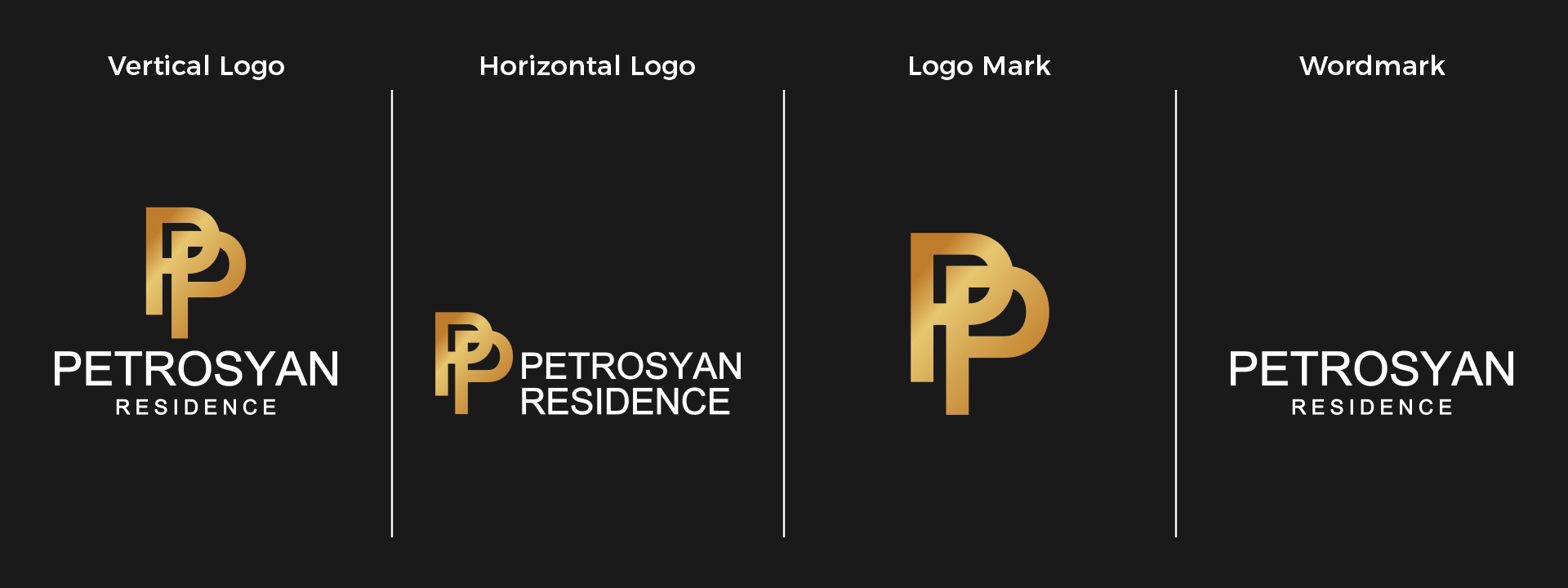
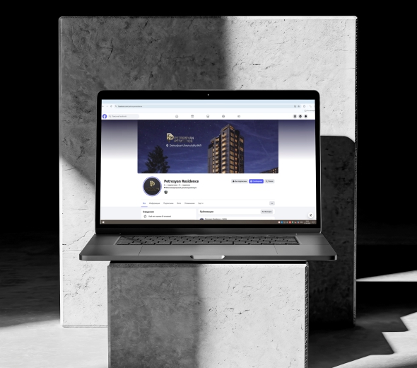
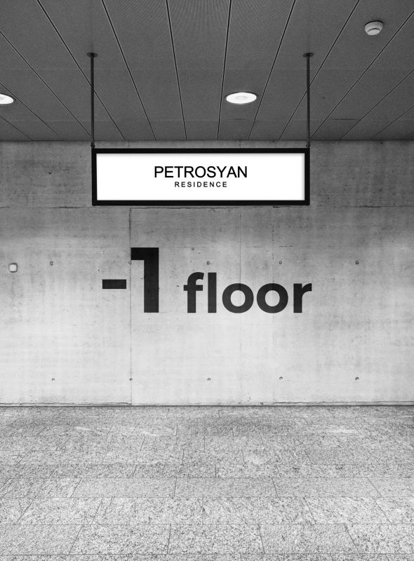
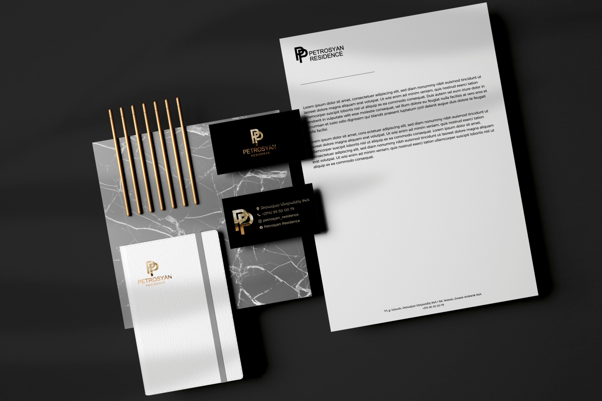
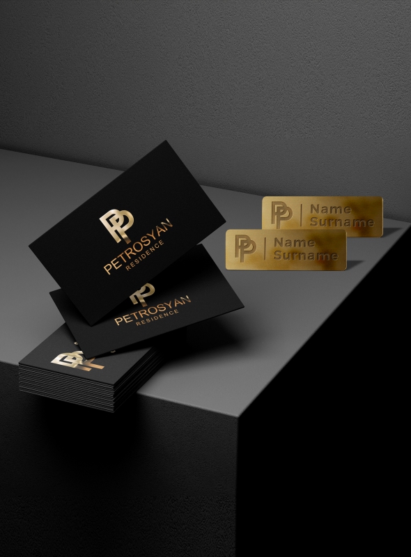
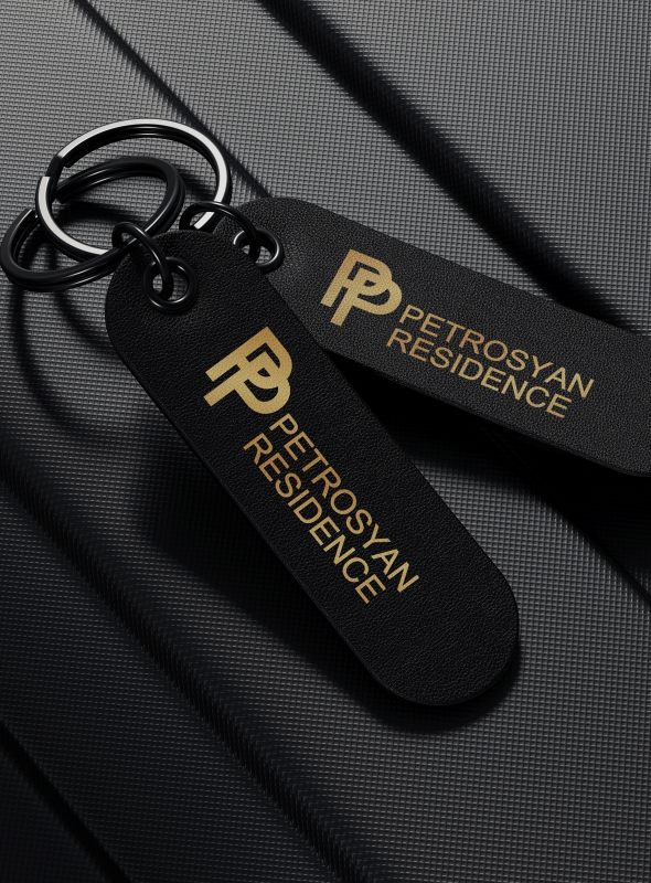
The logo created by "Sparsis" International Marketing Agency represents the modern and refined identity of Petrosyan Residence.
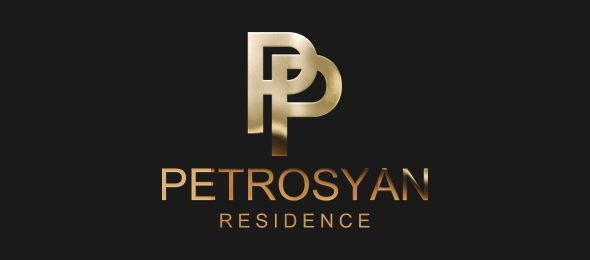
The logo is a combination mark, integrating both symbol and typography. At the center of the composition is a monogram formed by a double “P”. The use of black, white, and gold colors conveys luxury, confidence, and high status: black symbolizes strength and stability, white represents purity and balance, while gold reflects exclusivity and premium quality.
The minimalist and contemporary style completes the concept of a high-end residential environment, creating a memorable and timeless brand identity for Petrosyan Residence.