Logo Design & Branding
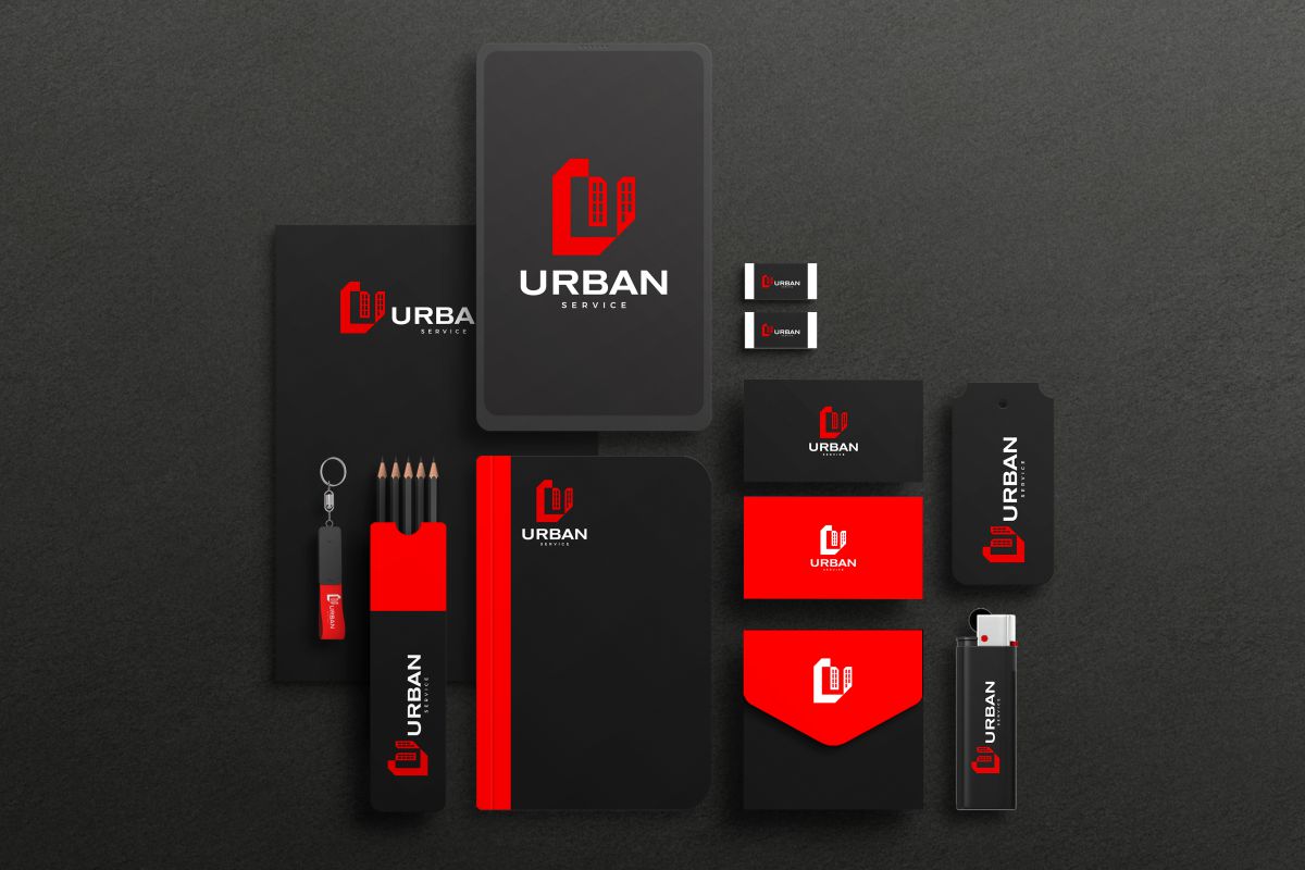
The logo of URBAN SERVICE reflects the main direction of the company's activity - management, maintenance and technical control of apartment and commercial buildings.
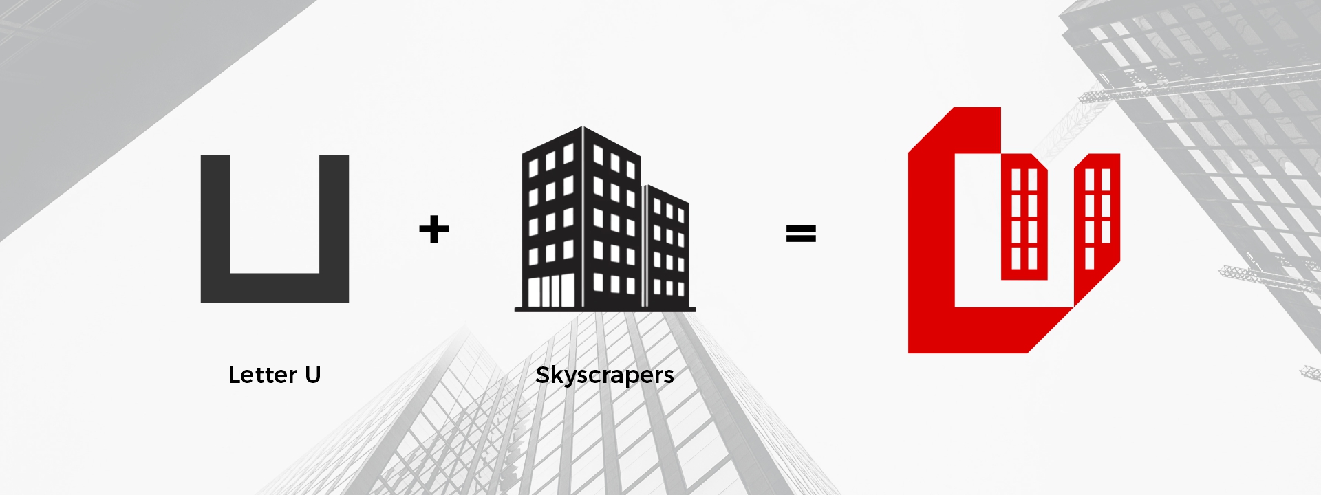
The logo is based on the Latin letter U. The letter is formed by strict geometric lines, which symbolize stability, reliability, structural strength, organized work.
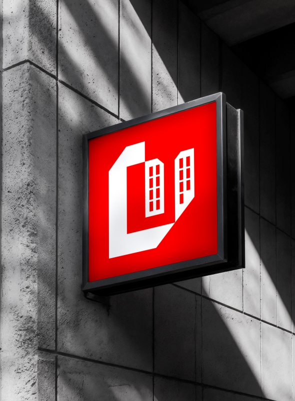
Part of the letter U is formed by contour windows, which immediately convey the company's field of activity - real estate and building management.
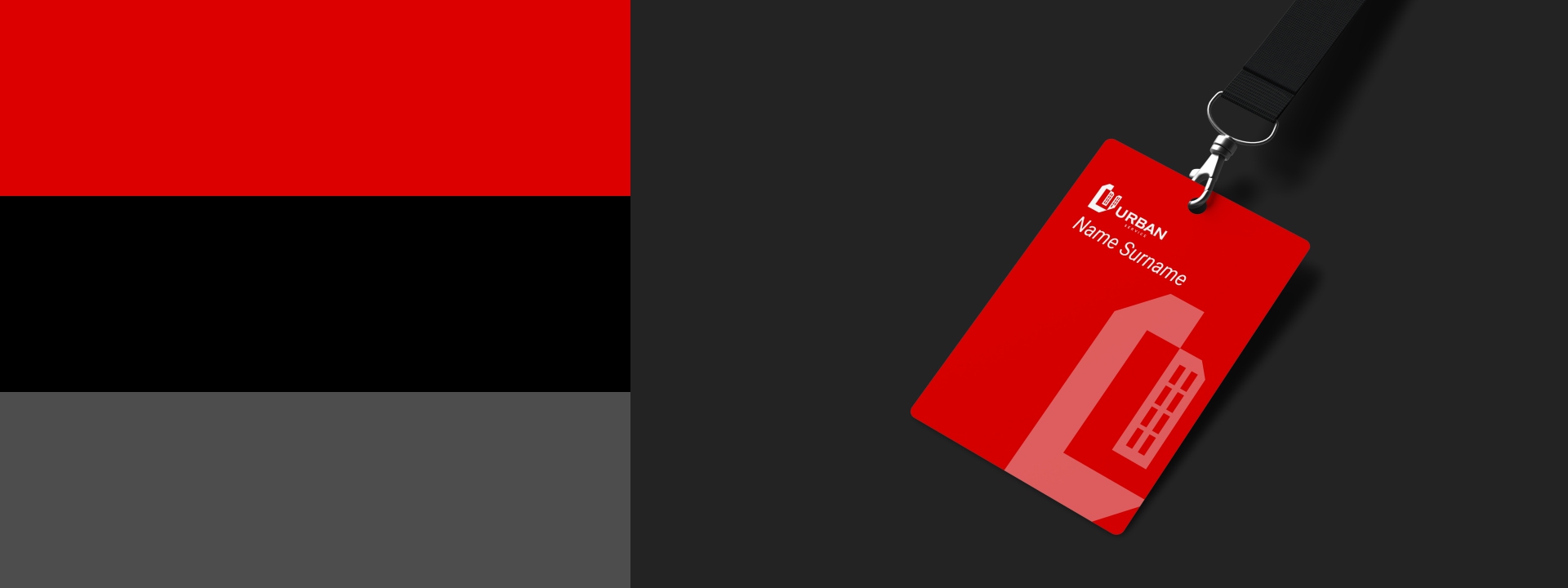
The red color symbolizes energy, responsibility and activity. The black color embodies professionalism, trust and authority. Light gray provides a clean and modern look.